
How Important Is Responsive Website Design in Saskatoon?
Responsive website design Saskatoon is essential for any business that wants to be found online. Most people in Saskatoon and across Canada browse the internet on their phones. If your website does not look good or work well on mobile, you could be losing customers before they even see your services.
A responsive website automatically adjusts to different screen sizes. This makes your website easy to use on phones, tablets, and desktops. It also improves your SEO and helps your business rank better in local searches.
Why Responsive Website Design Saskatoon Helps SEO
Google now uses mobile first indexing. This means Google ranks websites based on how they perform on mobile devices. If your website is not responsive, it may rank lower in search results, especially for local searches in Saskatoon.
A responsive website helps Google understand your site better and improves your chances of appearing in local search results. When your website loads quickly and looks good on mobile, more people will click, call, and visit your business.
How Responsive Design Improves User Experience
A responsive website improves user experience by making it easy to navigate. Visitors can find what they need without zooming in or struggling to click small buttons. When users have a good experience, they stay on your site longer. This sends positive signals to Google and helps your SEO.
Local customers in Saskatoon want quick answers. They do not want to wait for slow pages or deal with a website that does not display properly on their phone. A responsive website gives users a smooth experience and improves your chances of turning visitors into customers.
Benefits of Responsive Website Design for Saskatoon Businesses
Here are the main benefits of responsive website design:
-
Better mobile performance
-
Improved search rankings
-
Higher user engagement
-
More leads and calls
-
Stronger brand trust
Responsive design also makes your website easier to manage. You only need one website that works on all devices. This saves time and keeps your brand consistent.
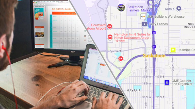
Local Search in Saskatoon Depends on Responsive Design
Many local searches in Saskatoon happen on mobile devices. When your website is responsive, users can quickly find your contact information, location, and services.
If your site is not mobile friendly, local customers may leave and choose a competitor instead. Responsive design helps your business stay competitive in Saskatoon and improves your chances of appearing in Google’s local search results.
Need a Responsive Website in Saskatoon?
If you want a mobile friendly website that ranks well and attracts local customers, Park Media can help. We build responsive websites designed to perform on all devices and improve your local SEO in Saskatoon and across Canada.